Features

The Stories Behind Rock's Most Iconic Album Covers

Nuclear Blast Entertainment President and industry legend Monte Conner reveals the true stories behind the most famous record sleeves of all time.

The Stories Behind Rock's Most Iconic Album Covers

There are certain rock albums that you know without ever hearing a note, because of their iconic album covers alone. Similarly, there are some names that are synonymous with heavy metal, not due to virtuoso guitar solos or world tours, but because of the sheer amount of work and love a person pours into the industry behind the scenes.

Monte Conner is one of those names: He’s now the President of Nuclear Blast Entertainment, but he previously spent over two decades as Senior Vice President of A&R at Roadrunner Records, where he was responsible for signing bands like Slipknot, Type O Negative, Machine Head, Sepultura, Gojira, and a huge list of others. His fervent love of heavy music helped shape the landscape of today’s metal scene, and his encyclopedic knowledge of the history of rock’n’roll should probably be extracted by scientists and stored in the Smithsonian for future generations to explore. (Seriously, they should figure out how to do that.)

When someone is that much of a heavy metal fan, their love doesn’t fade when they clock out for the day. So these days, Monte has taken on a passion project of unearthing the history of classic rock and heavy metal albums--sometimes a story behind the art, and sometimes just the original image it was taken from--and sharing his findings on his private Facebook page. His feed is a treasure-trove of historical tidbits on everyone from Bob Dylan to King Diamond, with a couple thousand friends eagerly awaiting his findings every week.

“What I post on Facebook are just images I have had for years that I have now decided to share,” Monte says. “What inspired me to start sharing was my general boredom with Facebook. So much of what I see on there falls into the category of bragging. I get that is what Facebook is for: showing off your life. But it’s not for me. And now politics has taken over the site as well.”

Monte’s knowledge of album art doesn’t just come from his personal history in the industry: He read magazines like Kerrang!, Shindig, Record Collector, Classic Rock, Metal Hammer, and Iron Fist for years and collected stories behind the creation of albums. With the addition of Wikipedia and its artist credits and references to articles on each band, he has been able to fill in gaps in his knowledge. He iterates that anyone could discover the same gems, if they’re willing to put in time.

“People act like it is magic but it is easy and it takes minutes, sometimes seconds. All you have to do is go into Google Images and any image ever used online in the entire history of the internet can be found with the right keywords, and if nothing shows up, you can experiment with the key words until you strike gold. There is no magic involved, just some research upfront so you know what you are looking for. I must stress that every image I use is just sitting there on the internet for anyone to see or to grab/copy. I do not own these images, nor are they unique or even rare (how can they be rare if they are online for all to see?). I simply connect the dots to share with others like me – and of course for my own satisfaction.

Though he is keen on keeping his posts to his friends-only Facebook page, he shared some of the weirdest, most fascinating tales behind his favorite albums with Kerrang! Read on for some rock’n’roll art history lessons, a la Monte Conner.

Iron Maiden – Iron Maiden (1980)

Interestingly--and gruesomely--enough, Eddie, the longstanding character at the forefront of Iron Maiden’s artwork, was meant to be a subtle protest against the horrors of war: His likeness was originally inspired by a terrifying photo of the head of a Japanese soldier, impaled on a tank during World War II. Iron Maiden’s debut album, which was also the debut of Eddie, features him in front of a wall that you can still visit in England’s Finbury Park today.

Monte writes, “This image is the origin of Eddie. It had been widely reported in 2006 (see below) and confirmed in the book Run For Cover: The Art of Derek Riggs. Says Mr. Riggs about the setting where he placed Eddie: ‘I was talking to a friend about when I used to live in Finsbury Park in London in the mid 1970s, and how run down it was back then. Well I went to look on Google Earth to see if it was still there and how much it had changed, and then I realized that I could get a street view. So this is a picture of the railway bridge and the wall and the houses in the background that inspired the background of the first Iron Maiden album cover. The trees weren't there then (it was over 30 years ago). The one remaining old curvy lamppost is the one that I used on the first Maiden cover.’”

Led Zeppelin – Physical Graffiti (1975)

The classic sixth album from the British pioneers of heavy features an apartment building in New York City’s East Village. The building still stands today, and anyone can walk by and catch a glimpse of rock’s most iconic images.

As Monte’s Facebook post on this artwork reads, “The big reveal is that the fourth floor of the five-story tenement buildings (at 96 and 98 St. Mark’s Place in the New York's East Village) was removed so as to better fit the image on a square album cover.”

Judas Priest – Sin After Sin (1977)

Sin After Sin was the follow-up to leather-clad heavy metal heroes Judas Priest’s second album, Sad Wings Of Destiny. The cover, which seems at first like your run-of-the-mill graveyard artwork, is actually the mausoleum of Colonel Alexander Gordon, who was killed at the battle of Waterloo.

“The only sin here is that we have gone our entire lives as Priest fanatics yet we have never seen these photos – until now!” writes Monte. "We all thought the Sin After Sin cover painting was created from scratch, but in reality it was based on an actual photograph of the Gordon Mausoleum, built in 1910 for Colonel Alexander Gordon, located on the grounds of Putney Vale Cemetery in London. I just learned of this myself recently when Bob Mayo (of thrash legends, Wargasm) unearthed this amazing find – the first photo you see below.

"The cover was the work of the late British photographer Bob Carlos Clarke, who (along with Hipgnosis) pioneered the process of taking black and white photographs and then airbrushing them with colored inks for the final result. Another key figure involved in the cover's creation was Rosław Szaybo, the Polish painter and photographer who served as the European art director of CBS Records from 1972 to 1988. In addition to his art direction on Sin After Sin, Szaybo also designed the covers of Stained Class, Killing Machine (known in the U.S. as Hell Bent for Leather) and British Steel (apparently, that is Szaybo’s own hand you see gripping the razor blade on the cover!). He also created the diagonal Judas Priest logo that debuted on Stained Class and is still in use today with only minor modifications.”

Dead Kennedys – Fresh Fruit For Rotting Vegetables (1980)

On May 21, 1979, San Francisco’s gay community erupted into riots when Dan White, the man who climbed into a window of the City Hall building with a .38 and 10 rounds of ammunition and murdered gay-rights activist Harvey Milk and then-Mayor George Moscone, was convicted of manslaughter--the lightest possible conviction for his crime--and sentenced to a mere 7 years in prison. (Writer’s note: He only served 5.) The gay community, as well as many allies, responded to the sentencing by rioting outside City Hall and lighting a row of police cars on fire. Dead Kennedys’ debut album, Fresh Fruit For Rotting Vegetables (which includes the songs California Uber Alles and Holiday In Cambodia) showcases a photograph from this night.

According to Monte, “A dark and chilling scene from the 1979 White Night Riots was shown on the cover of their legendary punk debut Fresh Fruit For Rotting Vegetables. Here are other cover-related shots of the burning police cruisers in front of San Francisco’s City Hall on that terrifying night.”

New York Dolls – New York Dolls (1973)

New York Dolls were quite polarizing amongst fans and record labels alike in the early ‘70s. Record labels were often reluctant to work with them due to their “vulgar” behavior onstage, as well as their effeminate clothing and makeup, and fans didn’t know what to make of their raucous sound. Despite the commercial failure of their 1973 debut, the album has gone down in history as one of the greatest debuts in rock history, as well as a key factor in shaping punk rock history.

Monte dug deep to find the story behind the creation of the debut’s album artwork, which features all five band members sitting on a couch they found in the trash outside:

“How cool would it have been to be a fly on the wall when Toshi Matsuo shot the band for their groundbreaking, genre-bending debut in 1973. Its controversial cover, shot intentionally for shock value, featured the band dressed in exaggerated drag, including high wigs, messy makeup, and high heels. Now you can be right there via these shots from that historic day. Let’s check in with guitarist Sylvain Sylvain for a firsthand account from a 2008 Guitar World interview: ‘The first album cover is my fault. Mercury needed a photo for the jacket, so they took us into this antique shop with these barber chairs, and I hated the result. You couldn’t see the Dolls because all the lighting was terrible! How the hell was anybody gonna see my roller skates! So I ran up to the office and said, ‘Wait! Wait! Wait! Let me get all my friends from the fashion business! No problem!’

"I had these two friends: Pinky and Diane. They were doing well as designers. I called up and said, ‘Pinky, you gotta help me!’ And she loved the Dolls! ‘Please, you gotta help me! I need a new session! I’ve only got six or seven hundred dollars!’ ’cause they spent thousands and thousands of dollars taking us to that antique shop with the barber chairs and all that shit. She got me Toshi, who was the photographer’s photographer then. Toshi was from Japan and he was pretty big in New York at the time, doing Vogue covers and getting $5,000 for it. We got Shin, which was the hairdresser, who added in a few curls on us and all that sorta stuff. And we had this American guy, like one of these Mercer Arts Center guys with the glitter in his beard, and he did the makeup. If anything, if we were too flamboyant, it was his fault. I remember Pinky and Diane putting the white satin and tacks on that couch. That couch was in the garbage on Park Avenue! It was in the fucking trash! We sat there, and the rest was history. I remember Johnny coming in at the backroom at Max’s and saying, ‘We just got the cover art! Look! Look! Look!’ And he loved it. It was so cool.’”

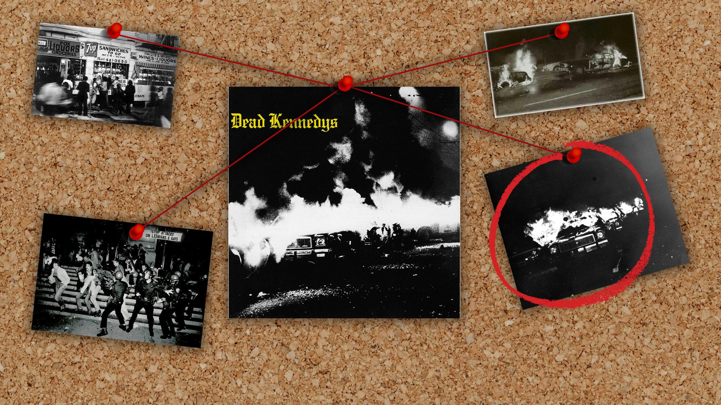
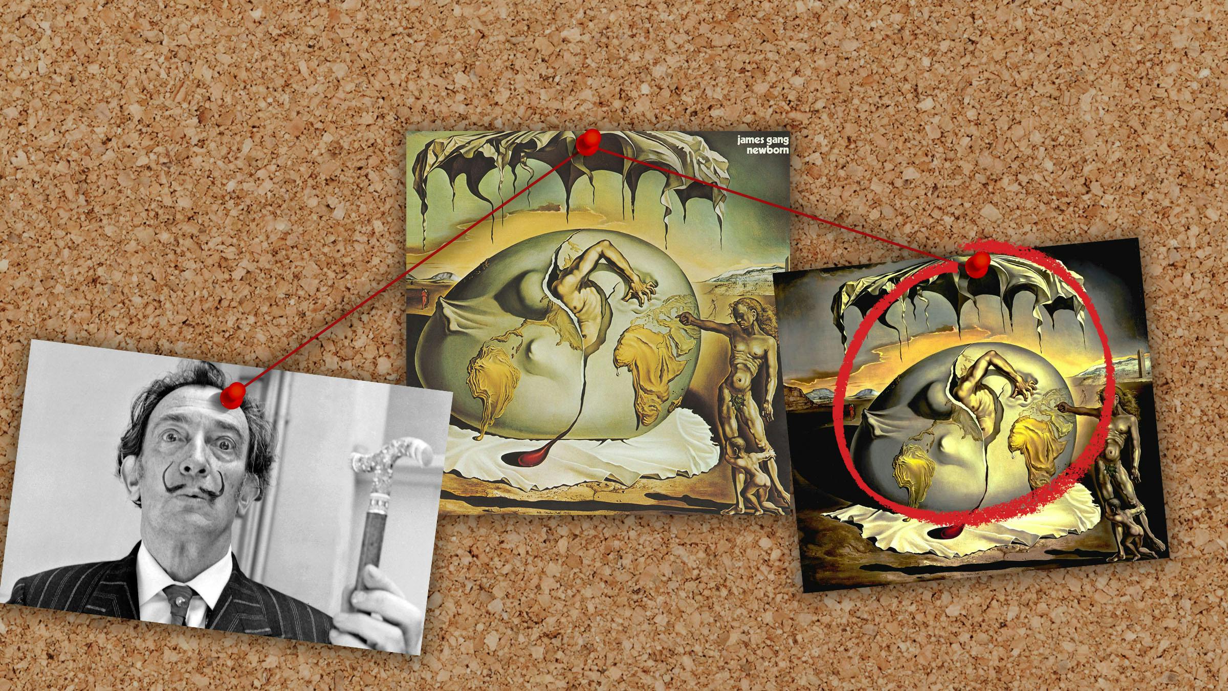
James Gang – Newborn (1975)

The cover art for James Gang’s Newborn record is simply the licensed image of quirky Spanish surrealist painter Salvador Dali’s 1943 painting, Geopoliticus Child Watching the Birth of the New Man.

Monte unearthed the story behind the licensing of the painting, which included a chance meeting with Dali himself--who was tripping people with his cane in a New York City hotel lobby.

“After losing both Joe Walsh and Tommy Bolin, the James Gang were almost wiped out,” writes Monte. "But they weren’t going down without a fight, and lived to ride again… for just a bit longer.

"While being interviewed in 2013 for the liner notes of a reissue of Newborn on Lemon Recordings (a division of Cherry Red Records), drummer Jimmy Fox told this highly amusing story of how Salvador Dali’s work, Geopoliticus Child Watching The Birth Of The New Man (1943), came to adorn the cover of the album: 'The original Dali Museum was located in a Cleveland suburb called Beachwood, OH, before moving to its current location in Florida. They were having a major exhibition and we went as a group to look around. We were enamored with the painting and we went about seeing if we could obtain the rights to use it. I think part of the attraction was the fact that the painting showed a 'new birth' and at that point, we were feeling a bit like the band was reborn as well. So the decision to use it was less overtly political but more personal. The museum told us that permission to use the art would have to come from Dali himself. Our management set about arranging a meeting, and was successful in setting up an appointment with Dali at his hotel in New York. I flew up to NYC on the appointed day and checked into the hotel. I called his room and was told by his wife that he was keeping his appointments in the King Cole Lounge in the hotel lobby. That’s when it got surreal. I went down to the lobby and saw Dali sitting in a chair, tripping people with his cane as they walked by (honest!).

'Before I could approach him, he got up and went in to the bar. There was a table prepared for him, and there was a line of people awaiting their time with him. When my turn came, I was ushered to his table, where he greeted me warmly (in Spanish). I sat down and explained to him what I wanted. We had a rock band named The James Gang… "Yes," he said. We made recordings… "Yes," he said. We were just finishing a new album… "Yes," he said. We had visited his museum in Cleveland and fell in love with one of his paintings… "Yes," he said. We were wondering if it would be possible to license it for use on our album cover… "NO," he said. And it was over. I flew home the following day. I explained to our manager what had happened, and he had a long conversation with Dali’s manager, who patiently told him that the reason we were denied permission to use the painting is ‘because we did not bring cash’! At that point, I left it to the managers to work out, and it was eventually done. But I certainly treasure the opportunity I had to meet this interesting and unusual man.’”

Rage Against The Machine – Rage Against The Machine (1992)

The cover of Rage Against The Machine’s debut album features the famous 1963 photo of Thích Quảng Đức, a Vietnamese Buddhist monk who lit himself on fire--and remained completely composed and emotionless throughout his self-immolation--in protest of the government’s oppression of the Buddhist religion. (It was this very photograph that persuaded U.S. President John F. Kennedy to withdraw support for then-Vietnamese President Ngô Đình Diệm's government.) Rage Against The Machine found it apt for their support for worldwide anti-oppression activism and licensed the image from photographer Malcom Browne.

Monte writes, “It’s cool to see the full shot in such clarity. But check out the alternate shot below which shows the monk further along in his incineration. Brutal.”

Black Sabbath – Sabbath Bloody Sabbath (1973)

Apparently, we almost got a white cover for Black Sabbath’s fifth album, says Monte:

"Bloody hell! Check out the original cover design submitted by illustrator Drew Struzan. I guess the white border was not heavy metal enough. Clearly, the right decisions were made as the black border and Teutonic type are far more effective, creating Sabbath’s most heavy metal sleeve. Fun fact #1: On the final cover you can see a circular remnant of the original Black Sabbath gothic lettering around the sides of the skull‎. Fun fact #2: On the final cover the type used for the title is very large, while the band’s name is very small. Fun fact #3: Drew went on to design the cover of Alice Cooper’s Welcome To My Nightmare and iconic film posters for Star Wars, Indiana Jones, Back To The Future and many other movies.”

UFO – Force It (1975)

The cover of UFO’s album Force It seems pretty tame until you see the original photo, which saw the light of day in England, but was censored for American audiences. Turns out there’s also a connection between UFO and the industrial band Throbbing Gristle.

Monte explains:

“U.S. buyers got cheated with this censored cover. The real cover on the right (which the UK punters got) was deliberately provocative and heightened further by the androgynous nature of the couple in the bathtub. Was it a man and a woman, or two women or two men? Fun fact‎ #1: The title is a pun as in "Faucet". This wit was lost on the Brits who call it a “tap”. Clearly the album was aimed at an American market, only ironically to be censored anyway. Fun fact #2: Many years later the couple were revealed as being Genesis P-Orridge and Cosi Fanni Tutti, co-founders of industrial pioneers Throbbing Gristle – in fact forming the band within a year of the cover shoot. The male, Genesis, now identifies as third gender.”

KISS – Dressed To Kill (1975)

The artwork for KISS’s third studio album was born of a silly photo shoot in New York City in which the members ditched their usual getup for business attire. Monte unearthed not only the original location for the shoot, but also a bunch of outtakes.

“Bob Gruen shot the Dressed To Kill cover on the southwest corner of W. 23rd St. and Eighth Ave. (looking north) in Manhattan on Oct. 26, 1974.‎ On that same day, KISS were shot in the subway at W. 14th St. and Eighth Ave. (also in costume), leading one to believe that maybe the subway shots were also considered for the cover. Enjoy the full forensics of this KISS-toric day above and below ground as well as the pics taken 5 months later when the band put the suits back on for a promo event (check out the cool shot with the band and Bob).”

Motörhead – Ace Of Spades (1980)

Motörhead were known for their rock’n’roll cowboy aesthetic, but their fourth album showcased them being just that: The three of them posed in a wild-west themed photoshoot that appears to be shot in Arizona, but was actually taken at a sandpit in Barnet, England.

Monte writes, “Tres hombres! You don’t see too many shots from the epic Ace Of Spades photo shoot, but oddly one randomly surfaced in 2001 on a Metal-is/Sanctuary reissue (pictured second here). Why did they change the iconic cover image? Enjoy these other out-takes while you play Shoot You In The Back – the song that spells out the cover. ‘The rider wearing black, he's gonna, he's gonna shoot you in the back, hey! In the western movies!’ Fun fact: Amazingly, the album is essentially mixed in mono! The guitars are almost right up the middle. Only the drums and percussion are in stereo, and there are occasional stereo guitar overdubs throughout. Yet no one even noticed. Not even I noticed until a few months back when Jack Endino pointed it out to me. A mindblowing reveal – but play it in headphones and its mono sound is plain as day. But boy does it work – which is why we all missed it.”

***

Words: Cat Jones
Illustrations: Jonathan Amaya

Now read these

The best of Kerrang! delivered straight to your inbox three times a week. What are you waiting for?