News

Represent reveal new Metallica collab collection
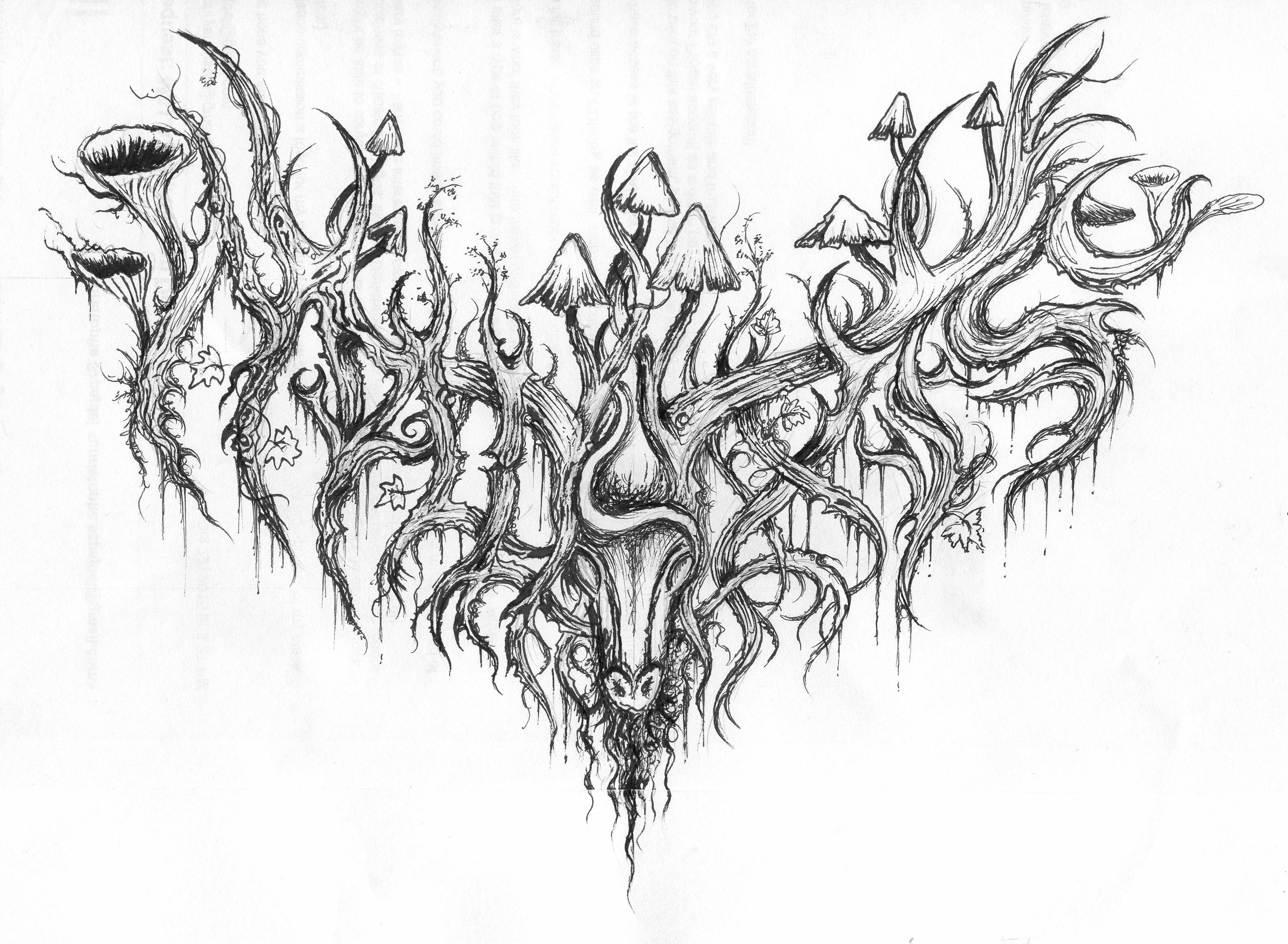
Represent have teamed up with Metallica for a new collaboration celebrating 40 years of Ride The Lightning and more…
… just in case you posers can’t decipher the image!
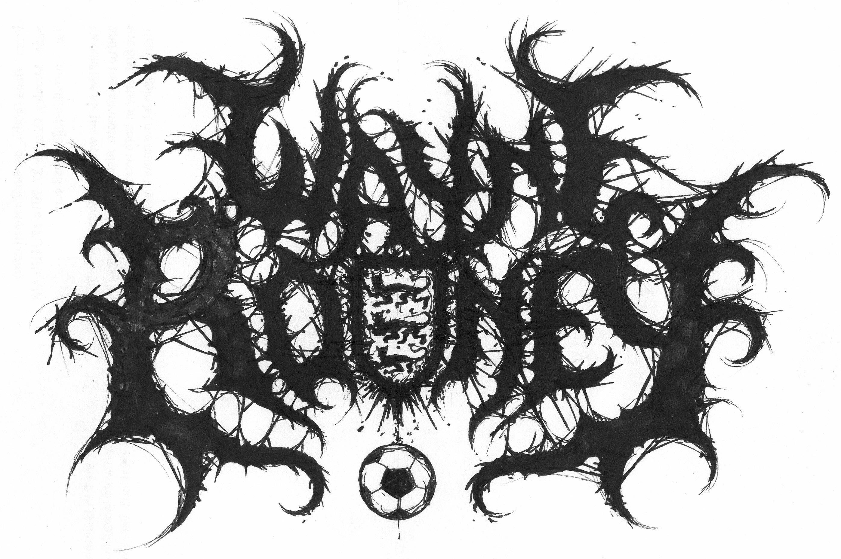
Imagine, if you can, a time before the internet. It seems unthinkable, obviously, but there was once a time when you didn’t have all the music ever recorded, and all the information about it anyone could ever want, at your fingertips. Sifting through piles of tapes or endless shelves of records trying to discover something new, you didn’t have a lot to go on – particularly in more niche subgenres that didn’t get any press coverage. Bands had to do what they could visually – a band name could offer some guidance, or an album title, but in the world of metal, logos did a lot of the heavy lifting.
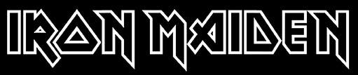
Black metal bands, death metal bands, grindcore bands and other inhabitants of the extreme end of the metal scale have ended up developing fantastic logos, from the savagely complex to the incredibly simple. Some look like demonic scrawlings, some like futuristic otherworldly messages, but they’re more than just branding, more than just a logo to slap on a T-shirt and a couple of patches: a logo is a statement of intent. Think of the note-perfect, epic feel of Iron Maiden and their logo’s parallel lines and mathematical precision, or the brutal barking of Napalm Death and the dense, messy chaos of theirs.
A lot of lives were changed by taking a chance on a band because the way they wrote their name looked badass.
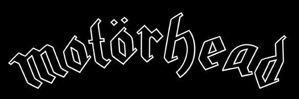
Bands had logos before metal existed – The Beatles had that thing with the big T, the Kinks had a thing where all the letters in their name were feet, the Rolling Stones had their big tongue – but it was with the arrival of some of rock and metal’s big guns that it really became a thing: KISS, Maiden, AC/DC and Motörhead.
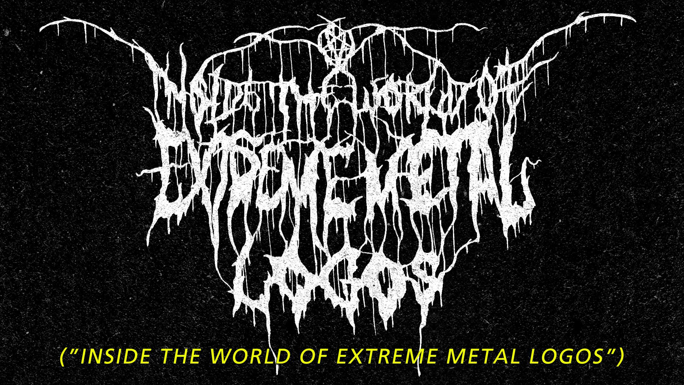
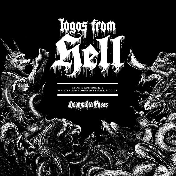
Mark Riddick is a graphic artist who has worked on designs for bands like Morbid Angel and Autopsy, and wrote and compiled Logos From Hell, an exhaustive, magnificent volume detailing the evolution and variation of the world of extreme metal logos.
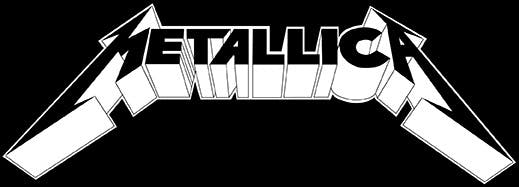
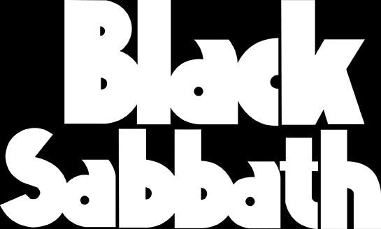
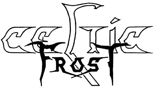
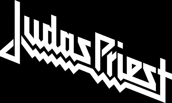
“I’m sure fans have varying opinions about the exact genesis of the heavy metal aesthetic” he says. “However, I’ll point to Black Sabbath, who are considered one of the major progenitors of the heavy metal genre. Other bands like Judas Priest, Metallica and Celtic Frost also paved the way for heavy metal logo evolution, just as they did simultaneously with their musical output in the genre.”
Glancing at a band’s logo might not just tell you they're metal – it might tell you what kind. “For the most part black and death metal logo aesthetics have evolved in their own directions,” says Dayal Patterson, founder of heavy metal book publisher Cult Never Dies. “Although, just as with the music, there is some blurring of the lines. But still, logos in metal are often specific enough in their characteristics that they can tell the educated reader what subgenre is involved. In that sense they carry more information than merely the linguistic content. It’s almost a visual code.”
Mark agrees, outlining the basics in his book Logos From Hell: a death metal logo will often involve extreme elements like body parts, a black metal logo may incorporate religious elements with ornate calligraphy and symmetrical designs, and a thrash logo will tend to be sharp and clean.
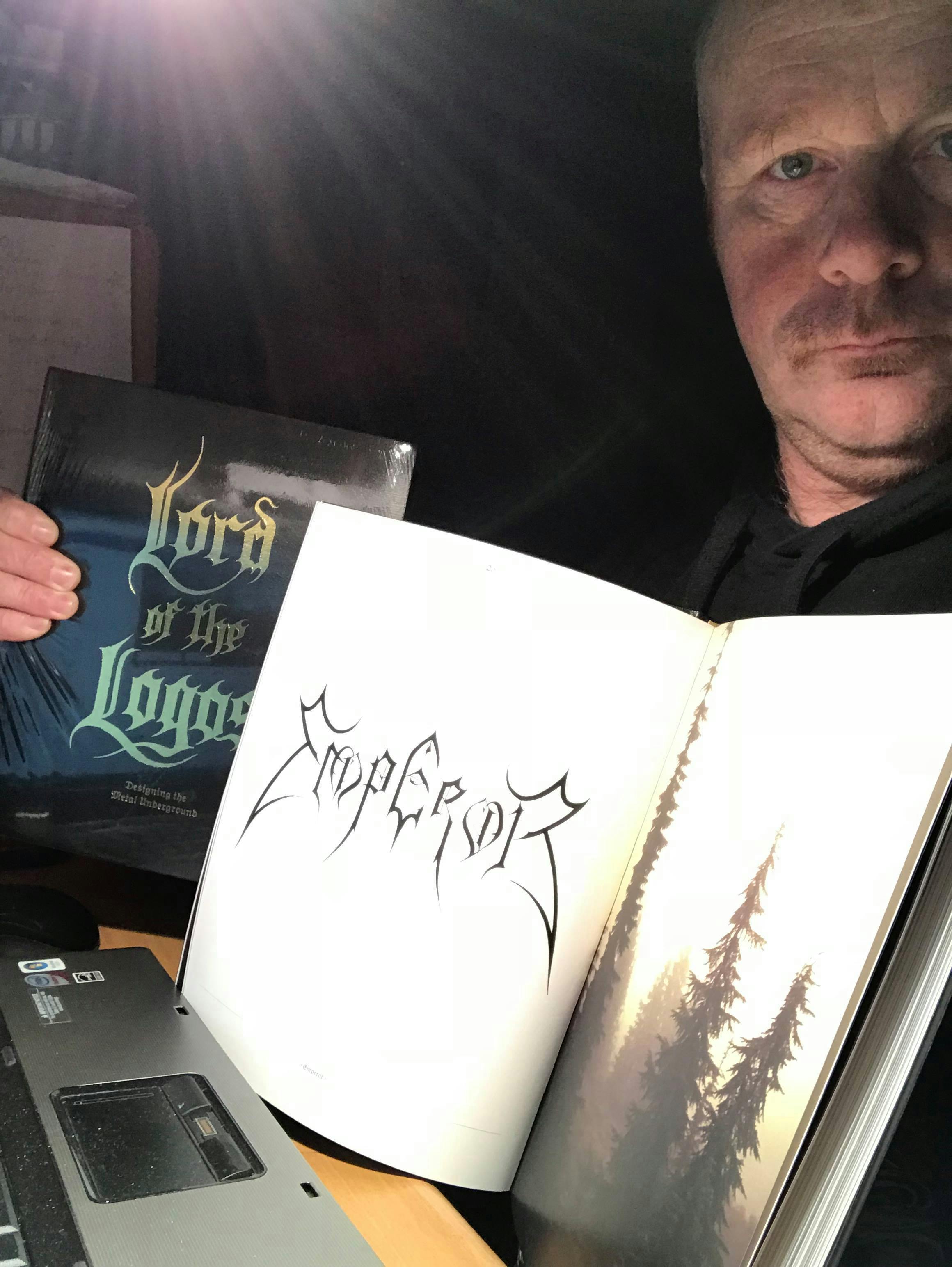
As with anything that becomes convention, it took a few incredibly influential logos to set the standard, striking game-changers that shaped the visual side of the growing world of metal. “The Mayhem logo is perhaps the best designed logo in metal,” says Dayal. “It always comes up as a favourite with metal designers. It looks suitably hostile, it’s complex yet readable, it’s symmetrical and includes two inverted crosses for good measure. The Emperor logo is another stroke of genius and its otherworldly look has meant it’s never really been copied (unlike the Mayhem logo). The Autopsy logo would be another good example – readable but very stylised and with many variations over the years.”
Emperor’s famous, influential logo was designed by Christophe Szpajdel, a Belgian artist now living in Exeter. Christophe has designed over 6,000 logos over the years, earning himself the nickname 'Lord of the Logos'. Working from his home studio, he designs logos for bands all over the world.
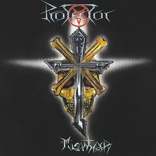
“I started back in the early ’80s,” he says. “I was fascinated from the beginning with logos from different bands – not only metal bands but also rock bands. An effective logo has to have a visual impact, where even if you’ve only seen it once, you remember it. Even if it’s a font. AC/DC, KISS, Iron Maiden, Venom. I love the Venom logo, it’s one of the ones that inspired me. Metal was definitely something that shaped me artistically. A band that shook my heart was Protector, from Germany, especially their first album, Misanthropy. I heard them and realised, 'Wow, this is the thing I’ve been looking for. I was fascinated by logos of bands like Possessed, Sabbat, Grim Reaper, Helloween and Armored Saint.'”
Christophe designed logos for fanzines and compilations before his big break in 1994, designing the iconic ‘evil eye’ logo for Emperor. He’s still one of the most sought-after artists in the field.
“When I’m commissioned to do a band’s logo, the most important thing I do is listen to the band” says Christophe, who is available for commission via Facebook. “I’ll always start with quick sketches. Listening to the promos and links the band send me as musical references for the logo is absolutely necessary but not sufficient. If I do a logo based totally on the music, 90 per cent of the time it’ll be rejected. There needs to be a lot of discussion with the client, which is what the sketches are for.
“After the sketches are approved I do a fully developed draft on A4 paper. I’ll just hammer it out and scan it. I work freehand with pen on paper, with a drawing board, ruler and compass. Using the ruler and compass I’m still working freehand but I can use the measurements to make the designs work exactly how I want in terms of balance and symmetry. I’ve been using this same compass since I was at school in the ’80s. I studied biology – I wanted to study art, but my parents told me there was no future in it and I listened to them. Art schools rejected my work, that’s the sad truth.”
“Chemistry with a client is important,” says Christophe. “How quickly they respond, how enthusiastic they seem. If I send 10 sketches and I hear back in 10 minutes, we’re probably onto a winner.”
There’s a band from Chile who he has sent 160 sketches so far, to no avail. “They’ve told me none of them are anywhere close to what they’re imagining. I’ve had other clients I’ve sent one or two sketches, and we’ve immediately developed one and gone for it. No changes, no revisions, approved straight away.”
There are, however, certain bands who he has immediately found himself on the same wavelength as. “There was a very special chemistry with Wolves In The Throne Room. I did two logos, one which was based on their direction, and a second, much more vertical one where I said, ‘Hey guys, giving myself complete freedom, this is how I see your music.’ I did a very elongated, tall logo with four wolves in it – my interpretation of how I perceive their music.” This chemistry often – but not necessarily always – coincides with a deep appreciation for the band involved. “I could listen to them for hours” he says.
The non-metal world might occasionally turn its nose up at the genre, but the mainstream also sometimes embraces elements of it. Lord of the Logos Christophe Szpajdel found himself working for an unexpected client a few years back: Rihanna.
“I’ve raised my prices since working with Rihanna!” says Christophe. “I gave a business card out after an exhibition, and after a lot of emails I was put in touch with a lady in California. It was several weeks until it was clear we were talking about Rihanna, the singer. There were a lot of companies in the middle – Rihanna probably paid 10 times what I ended up with.” Christophe’s designs for the singer were exposed to a global audience when they formed the backdrop for a performance at the Video Music Awards.
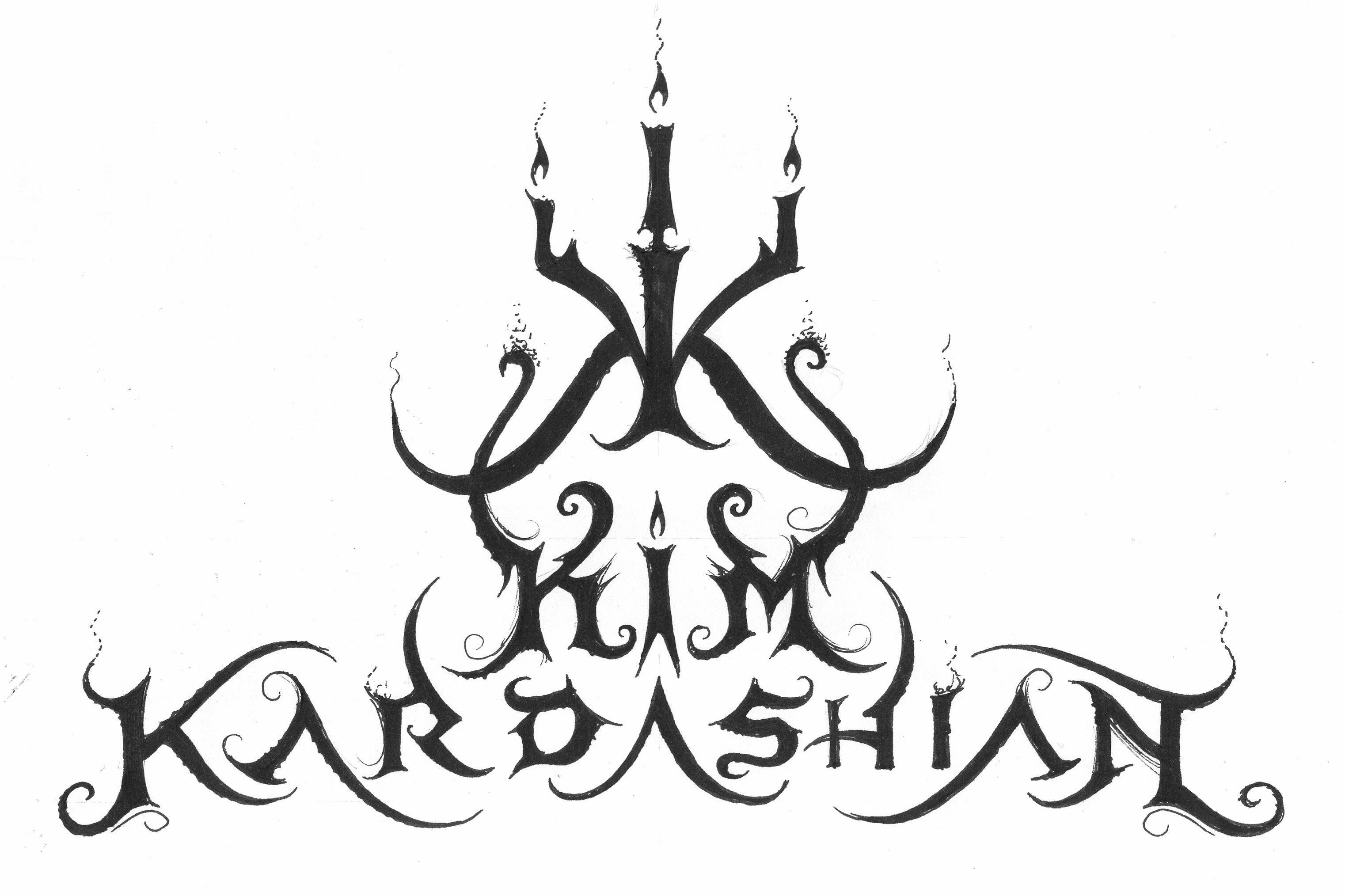
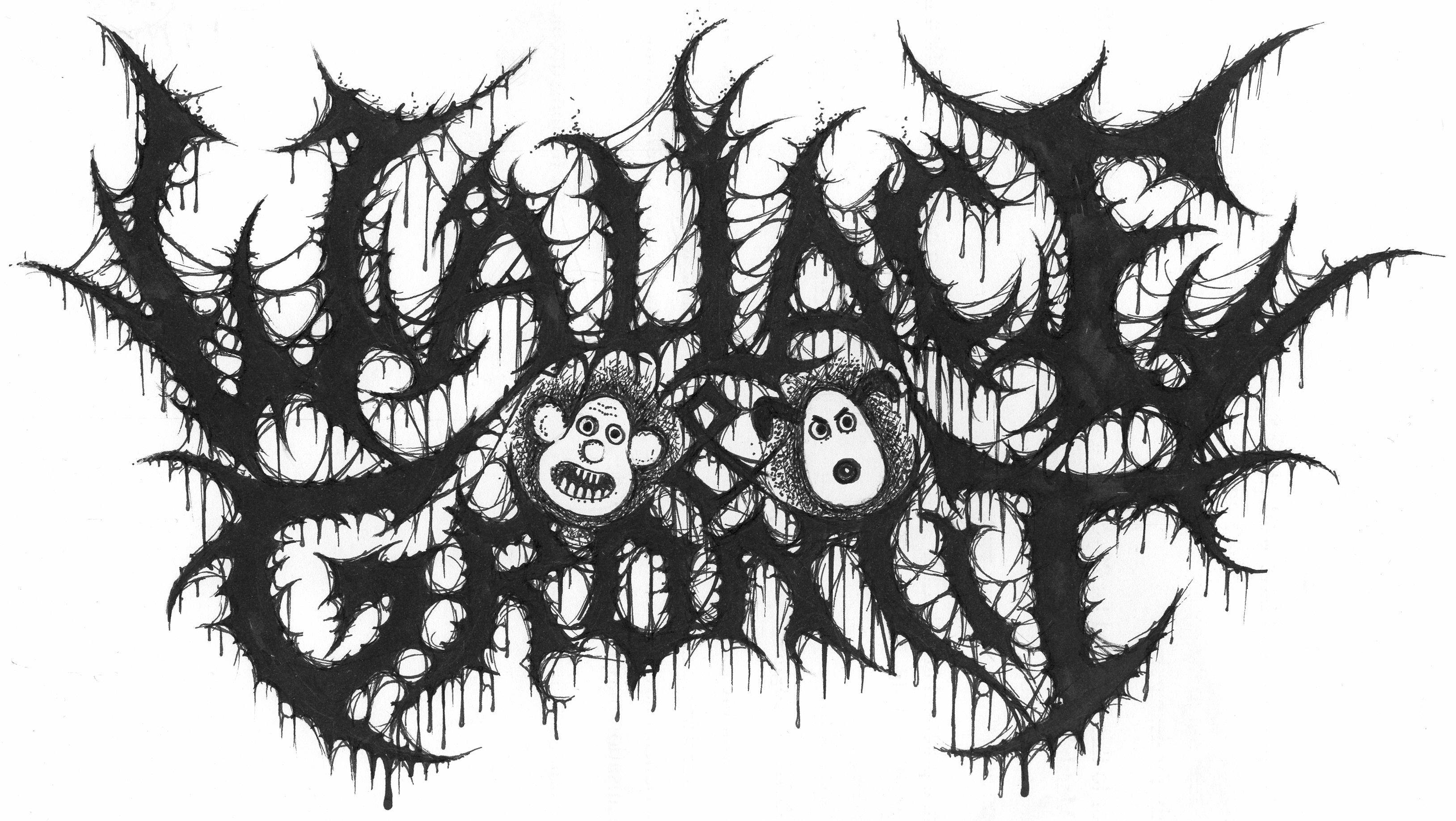
Passionate about lending the metal aesthetic to things you wouldn’t necessarily expect, Christophe is a big fan of making badass logos for less-badass things. “I like making logos for things you wouldn’t expect,” he says. “Coldplay, Nigella Lawson. Wayne Rooney. It’s a way of pleasuring myself I guess. I get the same kind of pleasure drawing a Wallace & Gromit logo as you might from an x-rated film! Eastenders, Coronation Street, these logos are very important to me. It’s fun to think about things like, what if Wallace & Gromit were in a brutal, guttural, snarling death metal band like Ultimate Trigger Mechanism?”
Occasionally metal logos can become a bit, er, silly. Some death metal logos are completely unreadable, where even when you’re told the name of the band, you kind of have to take it on faith that that’s what it says. You’ll see memes where a photo of a pile of sticks is labelled “my new death metal band’s logo”.
“I think there’s a lot of parallels to be drawn with the late ’60s, early ’70s San Francisco psychedelic rock scene,” says Dayal Patterson of Cult Never Dies, “where being able to decipher the text and information is part of being ‘switched on’ or in the know. In metal the more indecipherable logos have tended to belong to bands from the more extreme or underground sub genres – like black metal – where being understood by the average viewer is not desirable.”
“Although most bands tend to lean toward legibility for the sake of marketing, illegible logos also carry meaning and weight,” says Logos From Hell author and compiler Mark Riddick. “It can be assumed that the greater the illegibility the more extreme the band will be.”
“On a scale of one to 10, with one being totally unreadable and 10 being clear-cut, most of the time clients will want somewhere between six and 10,” explains Christophe. “Unreadable logos are for bands who are satisfying themselves, putting out a demo on 10 tapes for their friends.”
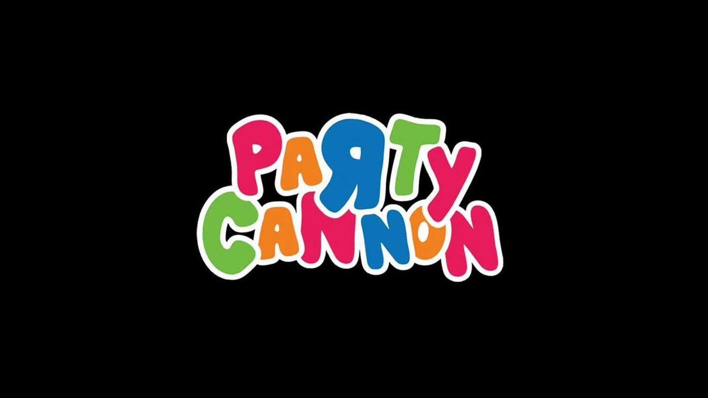
A few years ago, the Dunfermline grindcore band Party Cannon went viral, as a poster for Deathfest in Oakland featured dozens of conventional savage-looking logos and Party Cannon’s multicoloured, Toys’R’Us-esque logo.
“I love extreme metal logos and think of them as an artistic reflection of the music,” says the band’s Christopher Ryan. “It’s music that’s not meant to be accessible to anyone other than fans of extreme metal. Some of my favourite logos are Disentomb, Parasitic Ejaculation, Epicardiectomy, Defeated Sanity and, going way back, Obituary. There wasn’t really a conscious decision to go against the grain or try be different with our logo. When we first started the band we were influenced by brutal death metal as well as grindcore/powerviolence, and a lot of the bands we were into had a sense of humour with their names and song titles while still making 'serious' music – The Afternoon Gentlemen, Weekend Nachos, xharoldshitmanx, Spazz etc. While we enjoy brutal death metal themes and aesthetics, we found the tongue-in-cheek nature of grind a bit more memorable and relatable. I would say our logo and name were a natural way to combine our love of brutal death metal music with grindcore sensibilities rather than a direct protest to anything.”
“Extreme metal logos are a lot more diverse than people might think,” continues Christophe. His logos vary from incredibly simple shapes to extraordinarily complex, intricate designs incorporating varied ideas like Nordic symbols, pagan imagery and art nouveau. And with all of them, the music comes first. They aren’t branding exercises that happen to be used by metal bands, they’re metal through and through.
“I view heavy metal logos as a legitimate form of creative expression executed via a marriage between typography and visual presentation” says Mark Riddick. “Every one is essentially the gateway into a unique realm that each band conjures. Heavy metal logos relay visual information to potential fans, they have their own language, each logo tells a story or offers insight into a band’s overarching creative message. Having an enticing logo empowers a band’s marketability, solidifies their visual brand, and becomes an idol of worship for devout fans.”